BROADFIELD NEWS
Premium Editorial WordPress News Theme
Version 1.0 · By Keybrains · GPL v2
Live Demo: https://news.keybrains.io · Download
About Broadfield News
Broadfield News is a premium editorial WordPress theme built for the publishers who take their craft seriously. Inspired by the great broadsheet newspapers — the Financial Times, the Guardian, Le Monde — it brings typographic discipline, visual authority and editorial depth to the web.
Whether you are running a national news outlet, a niche industry publication, a city magazine or a solo editorial blog, Broadfield News gives you the visual credibility and editorial infrastructure to compete with the biggest names in digital publishing.
The theme ships ready to publish: one click installs 50+ sample articles across 13 categories, 8 author profiles, pre-configured menus, ticker items and all theme settings. Activate, import, and your site looks like this from day one.
| Live Demo See the full theme in action at https://news.keybrains.io — all pages, all features, all content. |
Homepage — The Full Broadsheet Experience
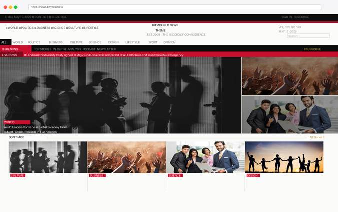
The homepage is a complete editorial composition. A full-width breaking news ticker feeds across the top. Below it, a hero grid of five articles dominates the viewport — the lead story occupies five-sevenths of the width with a cinematic image overlay; two side stories fill the right column. A four-card Don’t Miss grid follows, and the main content area then breaks into category sections with sidebar widgets.
Broadfield News homepage — hero grid, breaking ticker, section grids and sidebar
Three Distinct Header Styles
The masthead is the face of your publication. Broadfield News gives you three completely different header layouts, switchable instantly from the WordPress Customizer with a live preview — no page reload required.
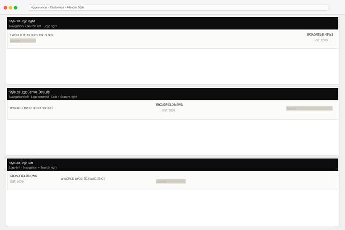
Three header layout options selectable from Appearance → Customize → Header Style
| Style 1 — Logo Right | Navigation links and search sit on the left. The logo anchors the right column. A strong directional layout with a modern editorial feel. |
| Style 2 — Logo Centre | The default broadsheet layout. Navigation on the left, logo centred, date and search on the right. Classic, authoritative, immediately recognisable as a serious news publication. |
| Style 3 — Logo Left | Logo sits on the left, all navigation and search on the right. Clean and contemporary — well-suited to brands with a strong logo or wordmark. |
Key Features
Single Article Layout
Every article page is a complete editorial experience. A full-width cinematic hero image at 520px height. The headline in DM Serif Display at 42px. A standfirst / deck paragraph in italic serif. Author byline with avatar, date and reading time. A drop-cap first letter in Bebas Neue that anchors the opening of every piece.
The article body renders at 19px DM Serif Display with 1.78 line height — optimised for long-form reading. Inline pullquotes, `<blockquote>` elements, and a tag row at the close. An author bio box. A four-card related stories grid. Comment threading where enabled.
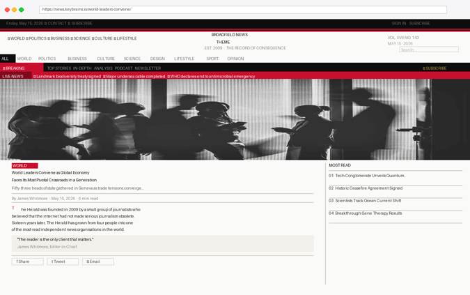
Single article — full-width hero, drop-cap, pullquote, author box and related stories
Category Archives
Each category page opens with a large editorial feature — a two-thirds-width hero with three stacked side stories filling the right column. Below it, a filter bar lets readers sort by Latest, Most Read, Analysis or Opinion. The article grid uses three columns at desktop, collapsing to two on tablet and one on mobile.
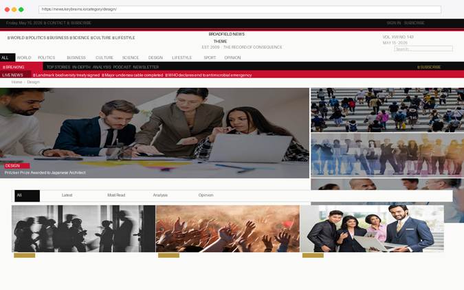
Category page — editorial hero, filter bar and three-column article grid
Author Profiles
Every author gets a rich profile page with a dark editorial banner, headshot, bio, and three statistics: articles published, years at the publication, and countries covered. Below the banner, a featured story panel and a paginated list of all the author’s work.
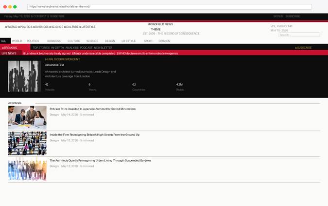
Author profile — dark editorial banner with statistics and article listing
Complete Feature List
| Homepage | Breaking news ticker, 5-article hero grid, Don’t Miss grid, World/Design/Culture/Science/Lifestyle sections, sidebar with social panel and popular posts widget. |
| Header | Three switchable layouts (logo left / centre / right), custom logo upload with size control, tagline, edition/volume display, Customizer live preview. |
| Single Article | Drop-cap, standfirst, share bar, pullquote, author bio box, related stories, tag row, comment threading. |
| Category Archive | Editorial hero + three side stories, filter bar, three-column grid, sidebar. |
| Author Pages | Dark editorial banner, avatar, bio, article/year/country statistics, featured story, article listing. |
| Search | Dark hero search bar, keyword highlighting in results, filter pills, sidebar. |
| About Page | Full-bleed banner, stat strip, values grid, timeline, team grid, partner logos, dark quote section. |
| Contact Page | Contact banner with quick-contact tiles, working PHP form, department cards, office locations, FAQ accordion, newsletter strip. |
| Footer | Four-column layout, footer logo upload, about text, column headings, social icon links, copyright override, footer menu, Key Brains credit. |
| Mobile Navigation | Hamburger menu with animated open/close, dropdown with all categories, search bar, subscribe link. |
| Customizer | Header style, logo image/size/alignment, tagline, volume, ticker label, promo button text/URL, footer logo, footer about, column headings, copyright, social URLs, brand colours — all with live postMessage preview. |
| Demo Content | One-click import: 50+ articles, 13 categories, 8 authors, menus, ticker items, pages (About, Contact, Subscribe, Privacy), theme settings. |
| Responsive | Five breakpoints: 1100px, 768px, 600px, 480px, 380px. Mobile-first approach, hamburger nav, collapsing grids, clamp() fluid typography. |
| Performance | Google Fonts loaded asynchronously, images use WordPress registered sizes (1280×640 hero, 800×500 feature, 600×380 card, 300×200 thumb, 200×200 square). No jQuery dependency beyond admin. |
| Compatibility | WordPress 6.0+, PHP 8.0+, tested to WP 6.7. GPL v2 licensed. Clean, well-commented code. |
Design System
Typography
Three typefaces form the complete editorial type system, all served from Google Fonts at no cost:
| Bebas Neue | Display font. Used for the masthead logo, section headings, navigation strips, numbers and callout figures. The signature voice of the theme — commanding, compressed, unmistakably editorial. |
| DM Serif Display | Serif editorial font. Used for article headlines, hero overlays, pullquotes, article body copy and author names. Warm, authoritative, and designed for long-form reading. |
| DM Sans | Humanist sans-serif. Used for UI elements, captions, meta text, bylines, navigation and all interface copy. Highly legible at small sizes. |
Colour System
| Ink (#0D0D0D) | Near-black used for headings, the masthead, nav strip, footer and all primary dark elements. |
| Paper (#FAFAF8) | Warm off-white page background — easier on the eyes than pure white for long reading sessions. |
| Cream (#F2F0EA) | Secondary background used for pullquotes, value cards and hover states. |
| Rule (#D4CFC4) | Warm mid-grey used for dividers, borders and separating elements. |
| Accent Red (#C8102E) | Primary brand colour. Category badges, breaking news ticker, section underlines, drop caps. Customisable via Appearance → Customize. |
| Accent Gold (#B8963E) | Secondary brand colour. Section heading accents, subscribe link, social highlights. Customisable via Appearance → Customize. |
Customizer Options
All settings are under Appearance → Customize → Broadfield News Settings. Changes show instantly in the live preview without a page reload.
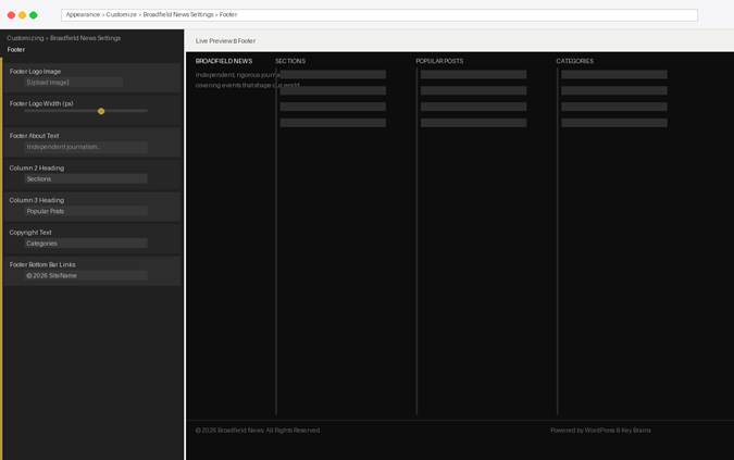
The Footer section in the Customizer — all settings update live in the preview pane
Header Style
Choose between three masthead layouts (Logo Right, Logo Centre, Logo Left). The preview updates immediately so you can compare before saving.
Logo
Upload a custom logo image (PNG, SVG or WebP). Set its display width (80–400 px) and max-height (0–200 px) with sliders. Enable retina/2× mode for sharp rendering on high-DPI displays. Toggle the tagline rule below the logo. Choose logo alignment (left, centre, right) within its column.
General
Masthead Tagline, Volume/Edition display, Ticker Label, Promo Strip Text, Promo Button Label, and Promo Button URL. All update live.
Footer
Footer Logo Image (separate from the masthead logo), Footer Logo Width slider, Footer About Text (textarea), Column 2/3/4 Headings, and Copyright Text (with HTML support).
Social Media
Enter the full URL for each platform (Facebook, Twitter/X, YouTube, Instagram, LinkedIn). Leave any field blank to hide that platform everywhere — sidebar widget, footer icons and mobile nav.
Brand Colors
Accent Red and Accent Gold colour pickers. Changes apply instantly across the entire theme.
Technical Specifications
| WordPress | Requires 6.0+, tested to 6.7 |
| PHP | Requires 8.0+ |
| Theme Slug | broadfield-news |
| Text Domain | broadfield-news |
| Author | Keybrains — https://keybrains.io |
| Theme URI | https://keybrains.io/products/news-theme/ |
| License | GNU General Public License v2 or later |
| Nav Menus | 5 registered locations: Primary, Topbar, Footer Navigation, Footer Bottom Bar Links, Section Tabs |
| Widget Areas | 7: Main Sidebar, Article Sidebar, Category Sidebar, Footer Column 1–4 |
| Image Sizes | 5: herald-hero (1280×640), herald-feature (800×500), herald-card (600×380), herald-thumb (300×200), herald-square (200×200) |
| Custom CPT | herald_ticker — Ticker Items managed from the WP admin |
| Custom Tax | herald_section — Section taxonomy for posts |
| Demo Articles | 50+ articles across 13 categories (World, Politics, Business, Culture, Science, Design, Lifestyle, Sport, Opinion, Travel, Food, Fashion, Tech) |
Broadfield News · A Keybrains Product